Autonomous crêpe robot
Maus Robotics
Designing a robot experience, not a vending machine.
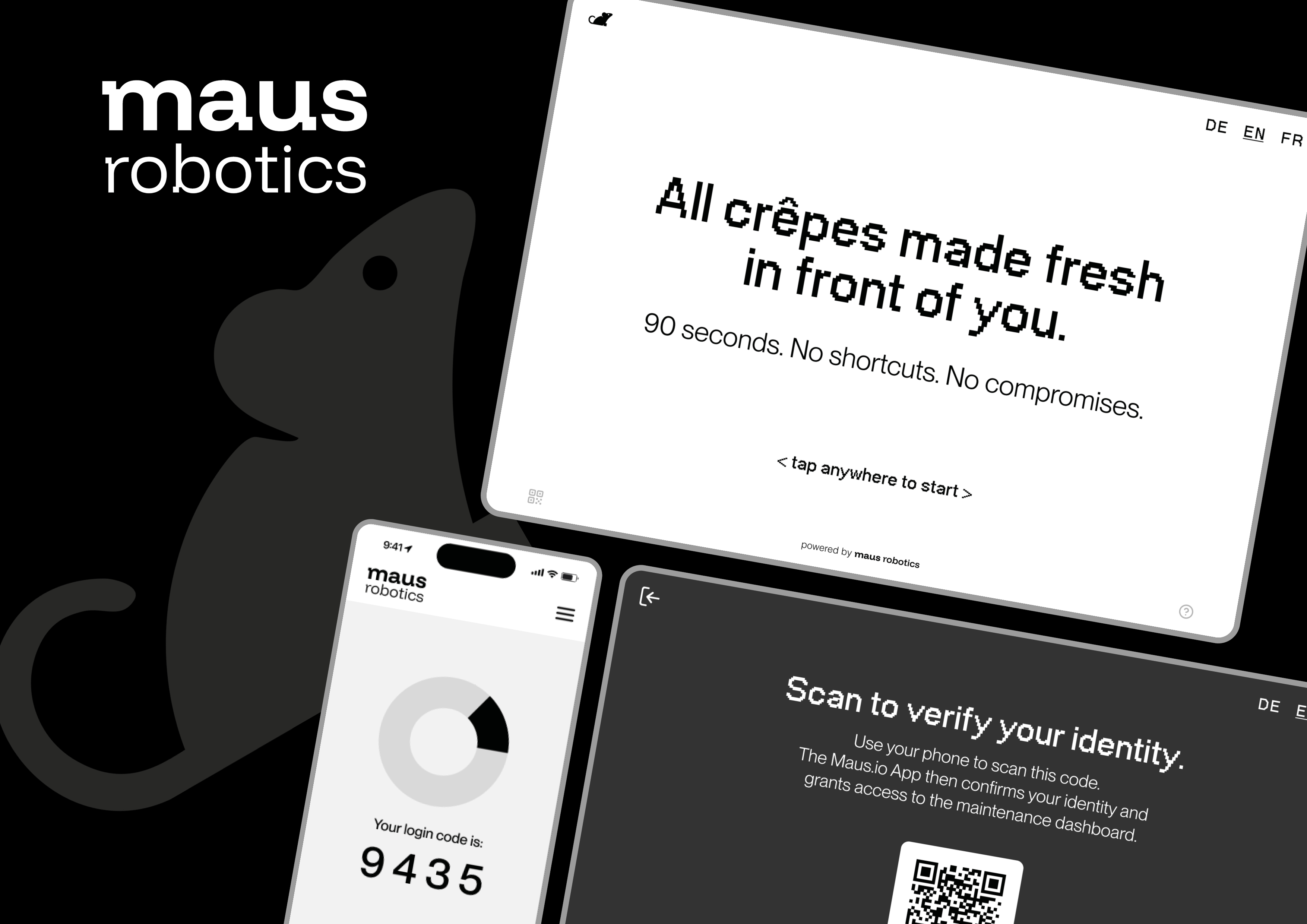
Creating a more engaging experience for an autonomous robot
Maus Robotics develops autonomous robots that prepare fresh crêpes from start to finish. Instead of hiding the process, the robot makes it visible – turning preparation into part of the experience.
My goal was to design an interface that makes ordering simple and intuitive while letting the physical robot remain the centre of attention.
Understanding the experience
The interface had to work in a public environment where people may approach the robot without any prior knowledge of how it works.
The challenge was therefore not simply to design a touchscreen, but to connect the digital interaction with the physical process behind it.
Clear
Users should understand what to do within seconds.
Trustworthy
The interface should communicate what is happening and create confidence in an autonomous food system.
Experiential
The robot itself should remain the main attraction – the interface supports the experience rather than competing with it.
Designing the journey
I structured the experience around the complete customer journey – from the first interaction with the robot to ordering, payment, preparation and collection.
A key decision was to keep the customer flow deliberately linear. Early explorations included additional features such as order history, reordering and support, but these proved too complex for an anonymous public touchscreen.
The scope was reduced to the moments that actually matter in this context.
Exploring the interface
The first concepts started with paper prototypes before moving into digital wireframes.
I explored different approaches for product selection, navigation, payment, preparation and the end of the experience. Each iteration helped reveal which information was essential and which features added unnecessary complexity.
A visual language built around precision
The visual identity combines technical precision with a more approachable character.
A strong black-and-white contrast creates focus, while colour is reserved for system feedback. Bitmap typography adds a distinctive digital character, supported by a highly legible grotesk for UI and body copy.
The result is an interface that feels technological and confident without becoming cold or overly complex.
Letting the robot take over
The most important interaction happens after the order is placed.
Instead of filling the waiting screen with information, the interface focuses on the robot's current activity. Progress, countdown and short process descriptions provide orientation while the physical preparation remains the visual focus.
The interface steps back. The robot takes the stage.
Designing for what people actually do
A high-fidelity prototype allowed me to test the complete ordering experience before moving further into the design.
Six test participants completed tasks covering the full journey – from starting the robot and selecting toppings to payment and collecting the finished crêpe.
The testing focused on intuitiveness, clarity, trust and the overall experience of interacting with an autonomous food robot.
What the testing revealed
The experience worked
The preparation screen became the emotional highlight of the journey. All participants understood the robot's process, and the visible physical interaction helped create trust.
The topping selection needed work
The biggest usability issue was multiple selection. None of the six participants immediately understood that several toppings could be combined.
Payment needed clearer feedback
The generic "Continue" button did not communicate that the next step would trigger payment. Participants also expected explicit confirmation after paying.
From feedback to Prototype 2.0
The second prototype translated the testing insights directly into design changes.
Tap anywhere to start
A clearer CTA removed the ambiguity around the start interaction.
Multiple toppings
The selection screen now communicates explicitly that toppings can be combined.
Product information
Each topping provides contextual information about ingredients and allergens.
Payment confirmation
The payment flow now clearly communicates the handover to the physical terminal and confirms successful payment.
Maintenance access
The maintenance area was moved deeper into the interface and secured through QR-based authentication.
One system, two very different users
The project also included a separate interface for maintenance staff.
While the customer interface is designed around discovery and experience, the maintenance dashboard focuses on prioritisation, clarity and efficiency.
Tasks are organised by urgency, while step-by-step instructions, status indicators and checklists help technicians understand what needs to happen next – especially when working under time pressure.
Outcome
The final concept connects the physical and digital sides of the Maus Robotics experience.
The customer interface creates a simple ordering journey and turns the robot's preparation process into an engaging moment. The maintenance interface supports the people responsible for keeping the system running.
Most importantly, the design does not try to make the screen the centre of the experience. It gives the robot room to be the experience.
What I learned
This project taught me that designing for an autonomous system means thinking beyond the interface itself.
Touch, movement, light, sound and the physical process all contribute to the experience. The most important design decision is therefore not always what to put on the screen – but knowing when the screen should step back.
The project also strengthened my approach to iterative design: testing assumptions early, reducing unnecessary complexity and connecting every major design change to an observed user need.