Web design, Rebrand
Jet2 – Rebrand
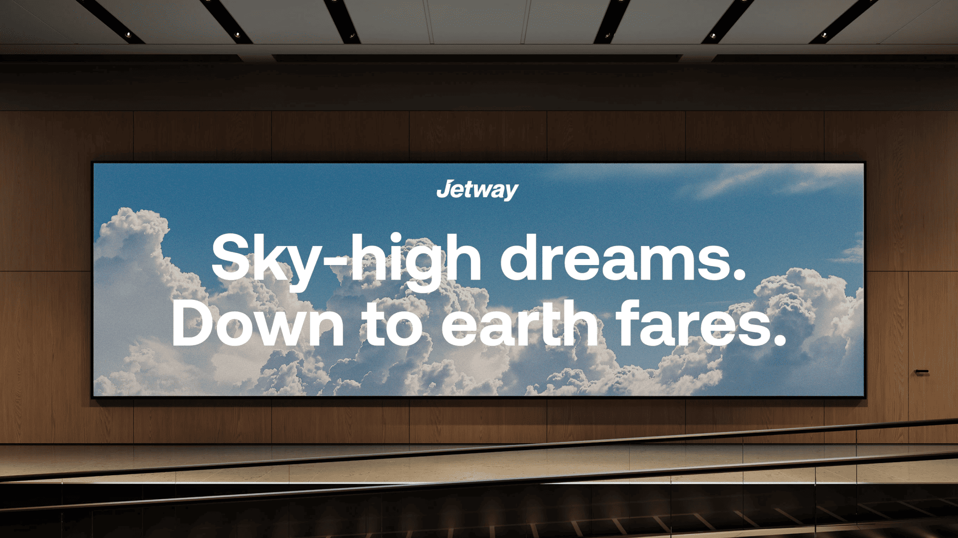
Creating a more distinctive and flexible identity for Jet2.
Jet2 already has strong brand recognition, but its visual identity relies heavily on a limited set of elements. The goal of this concept was to explore how the brand could feel more distinctive, contemporary and flexible across digital, social and physical touchpoints without losing its recognisable personality.
Understanding the existing brand
Before designing, I looked at Jet2's current identity, its digital presence and the visual language used by competing European airlines.
Recognition matters
Jet2's red is one of its strongest existing brand assets and should remain central to the identity.
Digital consistency
The visual system needed to work more consistently across booking interfaces, campaigns and social content.
A crowded category
Many low-cost airlines rely on loud colour and promotional messaging, creating an opportunity for a simpler and more distinctive system.
Bold
A strong typographic voice creates instant recognition.
Direct
Information should feel easy to scan and understand.
Flexible
The identity needs to work consistently across digital, print and environmental applications.
Exploring the visual language
I explored how typography, directional graphics and Jet2's existing red could form a more distinctive visual system before applying it across different touchpoints.

A more confident typographic voice
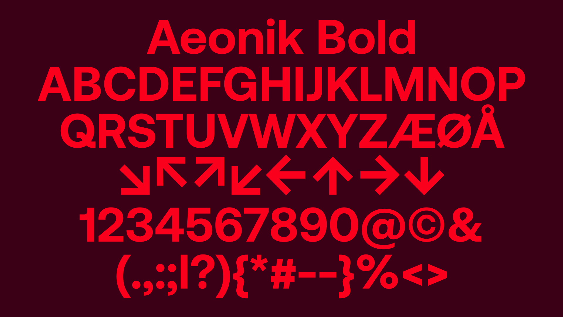
Aeonik became the foundation of the identity because its clean geometric forms work well at both display and interface sizes. Larger weights create impact in campaigns, while the simpler hierarchy keeps functional information clear.
Building on what people already recognise
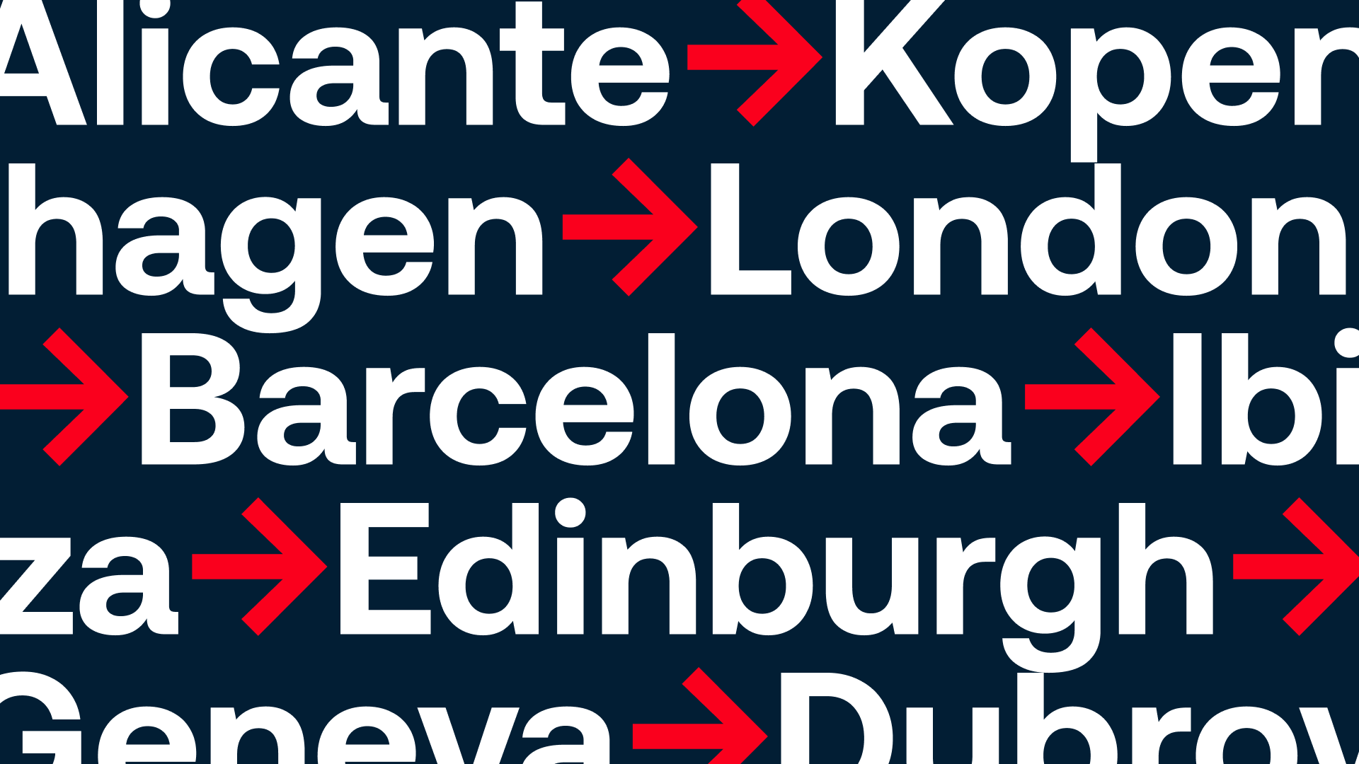
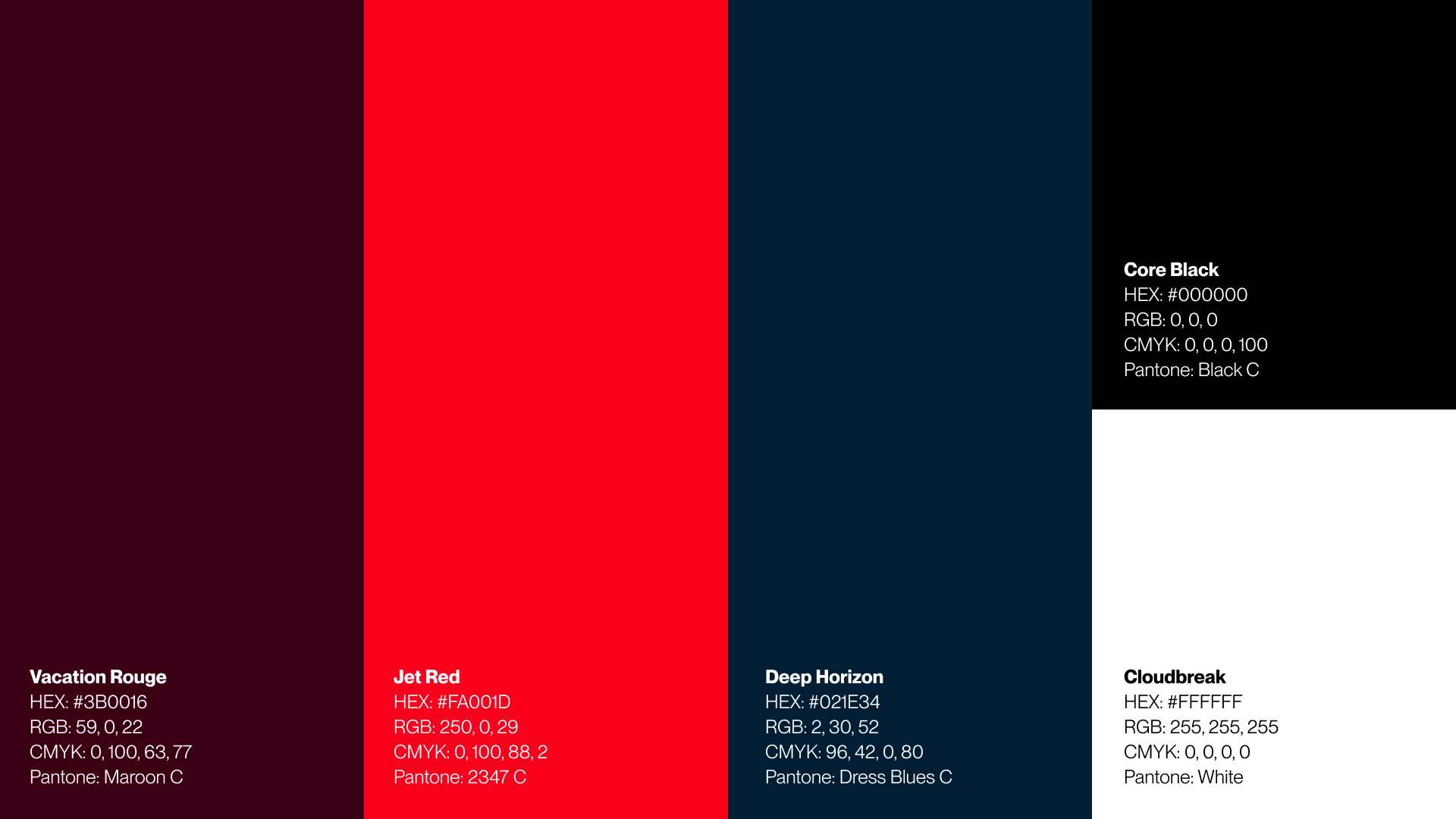
Rather than replacing Jet2's most recognisable colour, I used red as the starting point and expanded it into a more flexible palette. Navy introduces contrast, while the directional arrow becomes a recurring device for movement, destinations and calls to action.
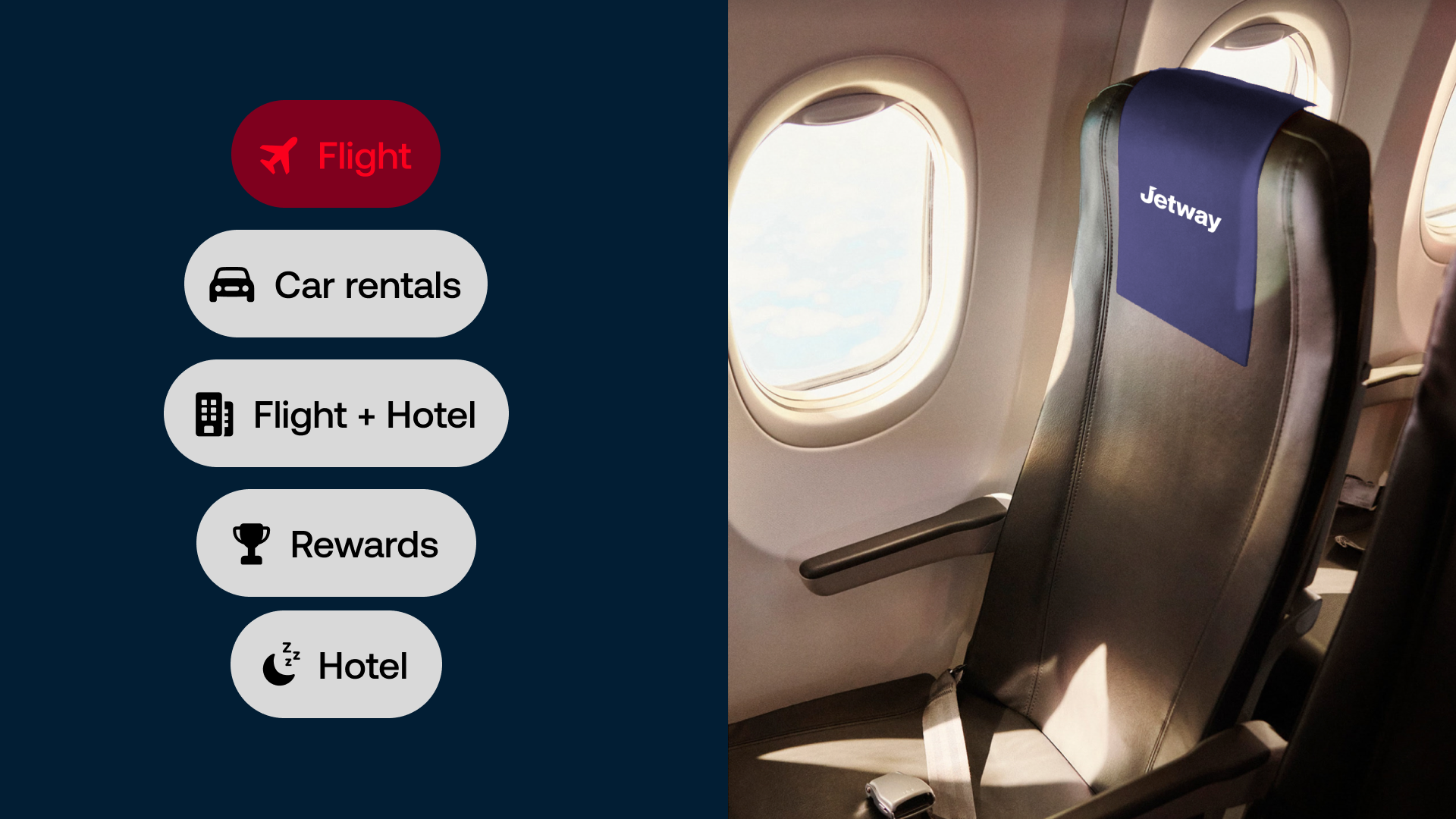
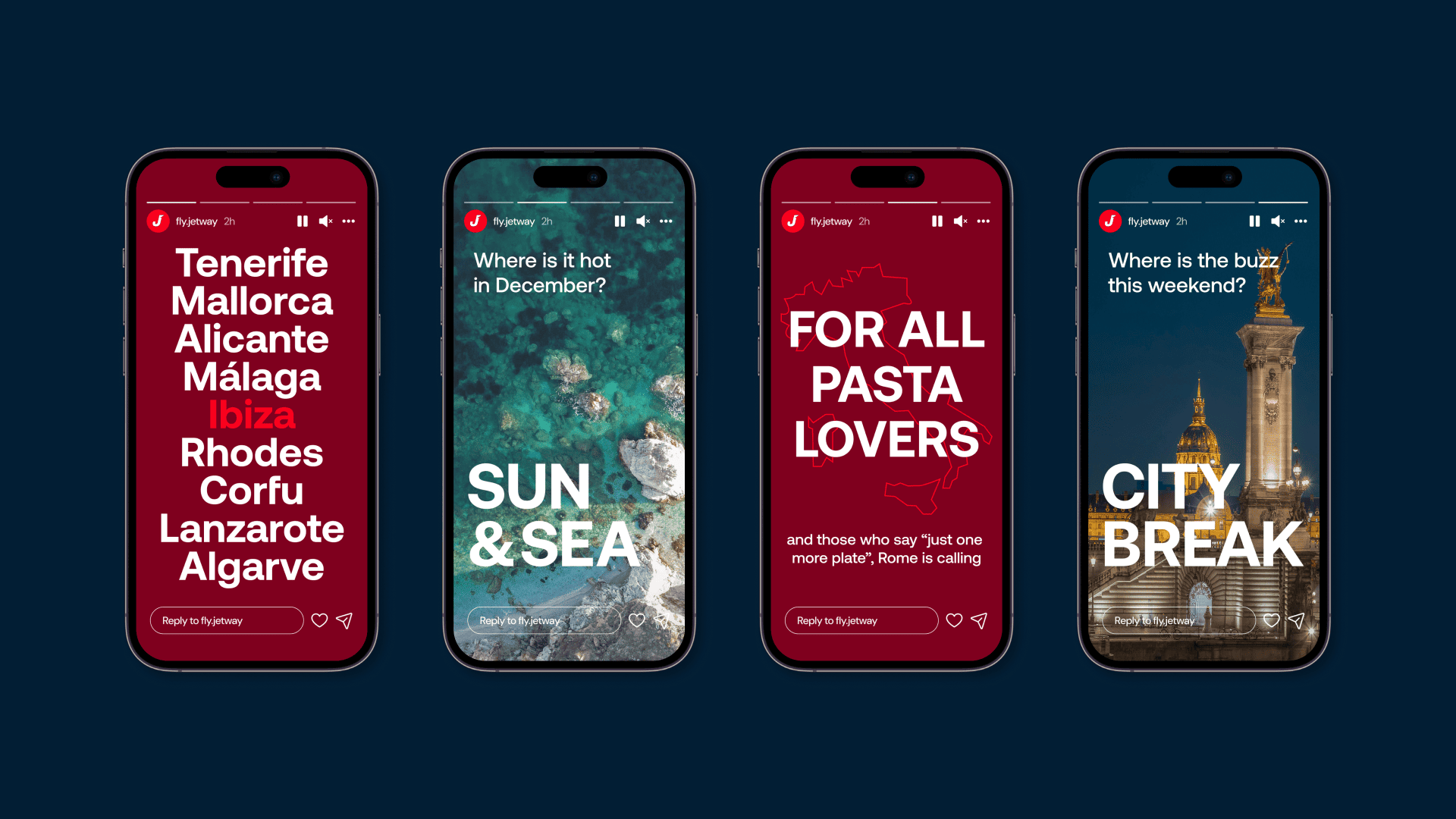
Designed to work digitally
The system was tested across mobile interfaces and campaign formats to see whether the identity could remain recognisable at different sizes and with different types of content.
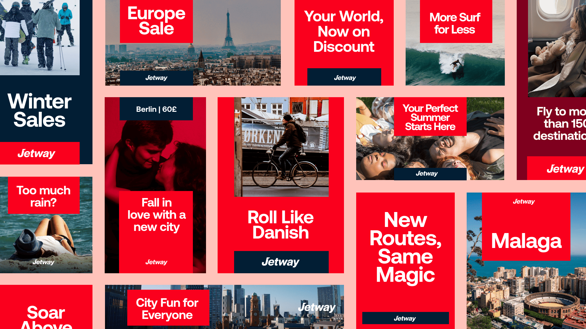
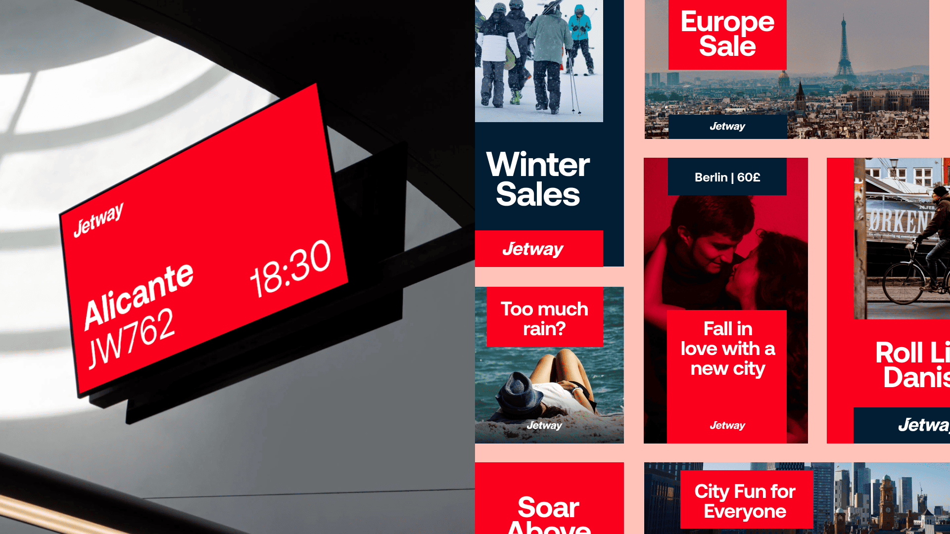
One system, multiple messages
A modular layout allows destination imagery, promotional messaging and brand typography to change without losing consistency. This creates variation across campaigns while keeping the overall system recognisable.
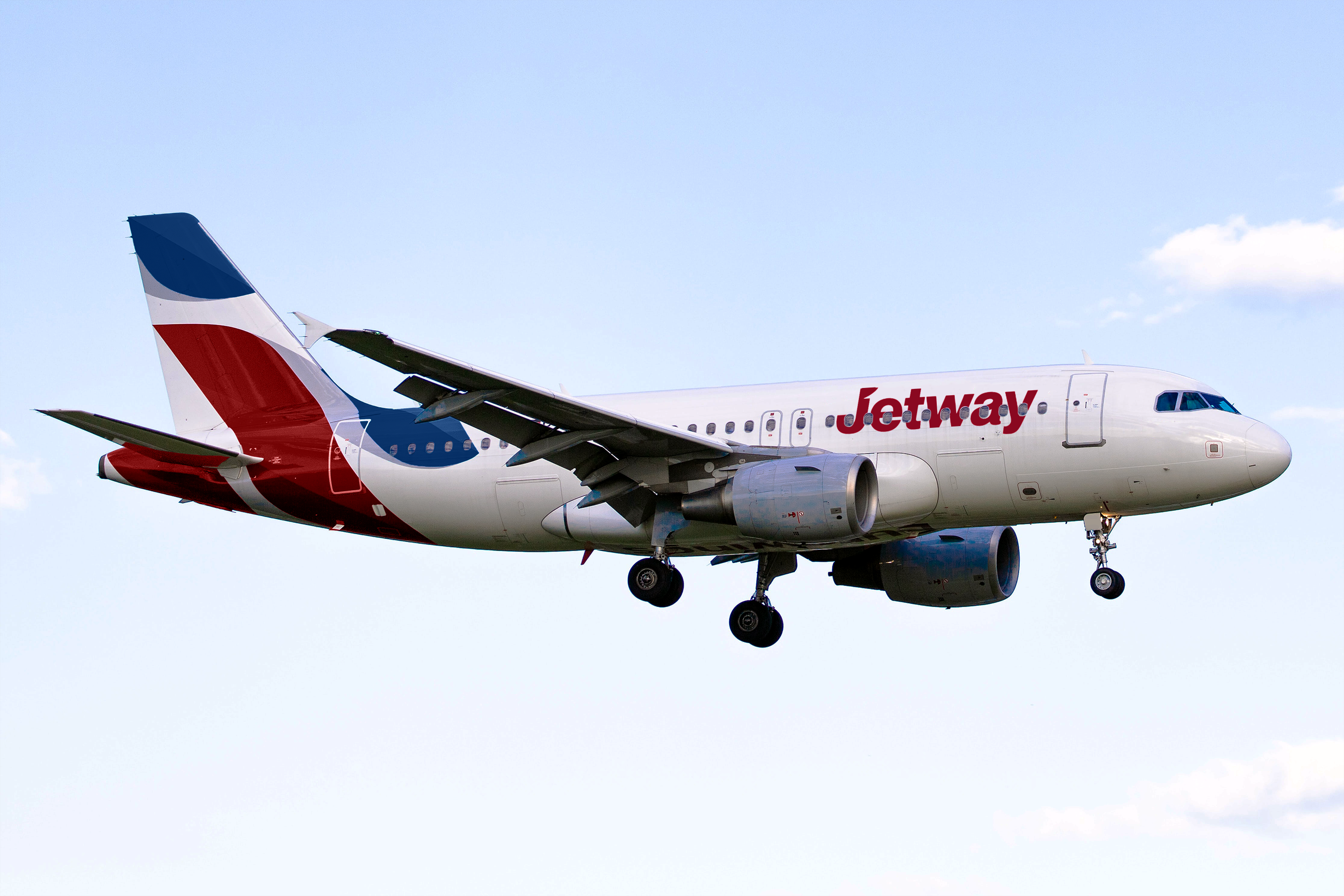
Extending the identity beyond the screen
The visual system was then applied to larger physical touchpoints to test whether the typography, colour and directional language could remain effective at scale.
Outcome
The final concept creates a more cohesive visual system across digital, campaign and physical touchpoints while retaining Jet2's recognisable red and direct personality.
- More consistent visual hierarchy
- Flexible campaign system
- Stronger connection between digital and physical touchpoints
- Recognisable core brand assets retained
What I learned
This project pushed me to think beyond individual layouts and focus on how a visual identity behaves as a system. If I developed the project further, I would validate the direction with users and test the system across a complete booking journey before refining the final identity.